Rebranding; A Change For Competitive Advantage
Fifteen years after the establishment of Dana Energy, I suggested to the board of directors in 2015 that we should rebrand the holding company, arguing that all reputable companies across the world retouch their corporate image every five to ten years. The rebranding idea coincided with the restructuring process that led to the emergence of Dana Energy as a corporation.
Big companies may also change their logos, while they are trying to rebrand and communicate a new message with their audience. In our case, that message was the structural change that was happening in the firm. So, the board agreed with the rebranding idea.
The rebranding work would help facilitate communication between the company and its audience. So, we immediately hired one of the leading contractors in the country to help us send out our new message – the new corporate governance.
We believed that our efforts would also help us reposition the brand with a premium image in the global market; given the fact we were trying to approach regional and international markets.
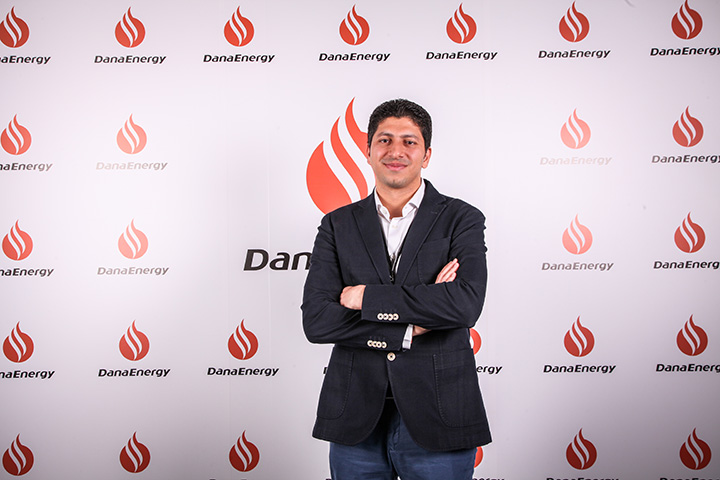
Our logo, however, had to be changed too, because it was very classical. It was initially designed in 2000 by Alireza Mostafazadeh, a prominent graphic designer in Iran. Given the industry having been captured by a younger generation in recent years, we decided to move toward a design with more modern elements.
As part of its new brand promise, the company tried to redefine a personality for its logo that was closely in line with its initial personality; that is, Dana Energy is a private, upstream oil company, which is a reliable partner for foreign companies interested in the Iranian energy market. We also wanted to send this message to international companies that Dana Energy is a one-stop shop that offers a multitude of oilfield services. So, we kept the DNA of our logo, which was a circle that symbolizes the sun and a flame that symbolizes heat, but made some minor changes in it.
In the restructuring process, we adopted a motto: Dana Energy is ‘stronger than ever’. We wanted our new logo to be able to reflect our motto in an effective way. We hope the whole process of rebranding and redesigning of our logo will lead to enhanced competitive advantage.
Mohammad Reza Iravani,
Chief Administrative Officer
We Answer Your Questions